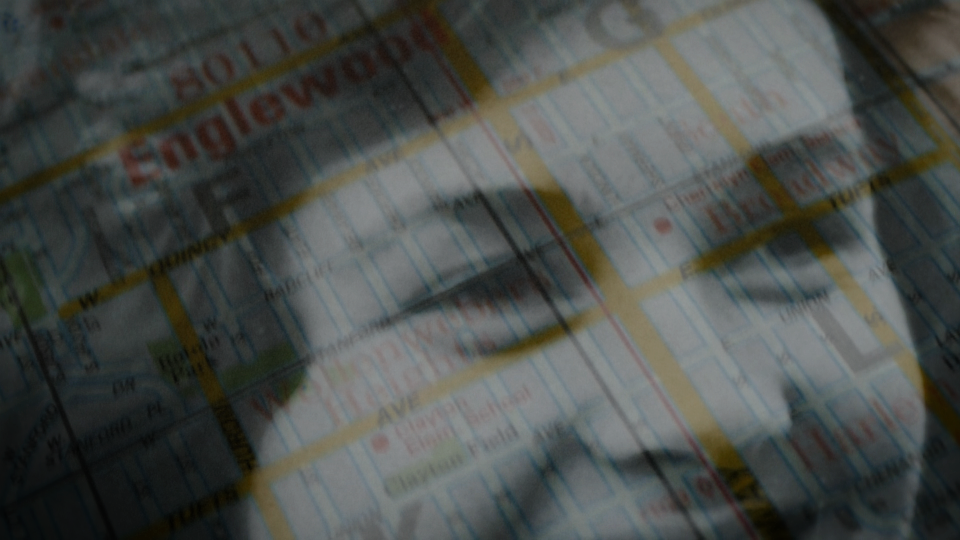
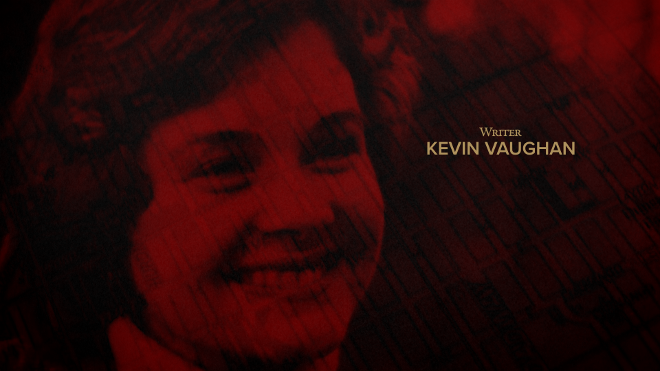
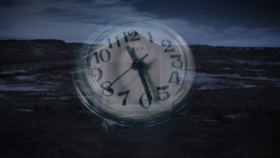
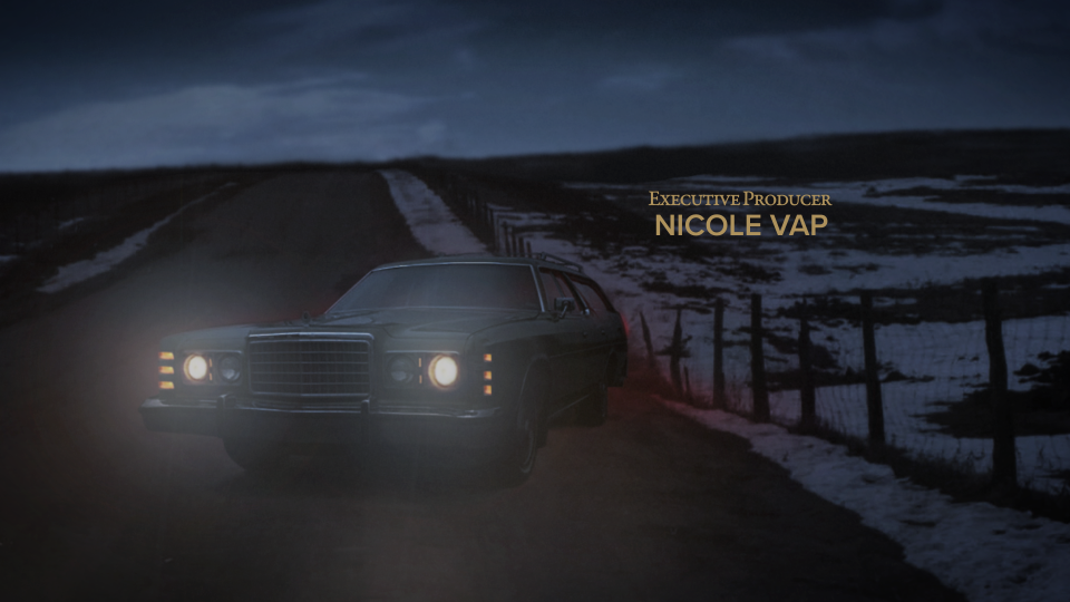
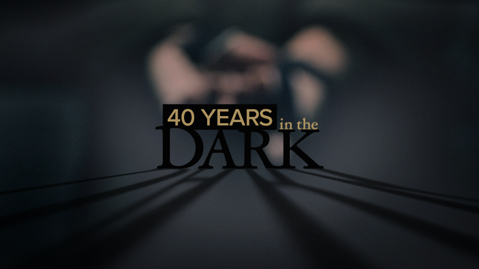
Title design – 9NEWS/9Wants to Know documentary 40 Years in the Dark: The 1980 murder of Helene Pruszynski.
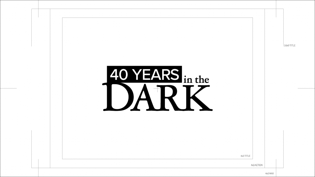
After poring over the available visual assets and learning as much as possible about the intricacies of the story, I started with a small selection of typefaces that reflected the initial feeling I had about the subject matter. Usually that’s the best place to begin for me. It’s almost like surrounding yourself with the essence of a thing until you sort of intuitively know where to go with it. You kind of walk around in the story’s shoes for a bit. If I can take that initial feeling and evoke a similar tone with letterforms, then that leads to a title lockup and informs where I tend to go with the design from there. 9NEWS’ styleguide defines several typefaces so I wanted to at least stay close to that if possible for part of the design. I veered off on my own too and chose Garamond Premier Pro for contrast and a few other reasons that I won’t go into too much detail about. But, this being a 40 year old news story that originated in 1980, the nice serifs of this version of Garamond seemed to have the right DNA.
And speaking of DNA, an obvious thing to do here would have been some science-y look and feel. The story was, after all, about how genetic genealogy solved a 40 year old murder case and led to capturing the monster that did this. But, that’s a little too obvious. This felt more about Helene and finally getting justice for her. And it seemed right to paint a picture of what an awful thing had happened to such an innocent person with such a bright future in the title sequence and then let the story tell you about catching the guy. Setting that scene was the better choice. We had a limited amount of time up front for a title sequence too, so it had to be quick.
Producer and editor Anna Hewson selected a music track and mixed it with an actual recording of Helene singing in a choir. This was a huge inspiration for the direction of the visuals and again, set the perfect tone. The choir singing “…there’s a light in the depth of your darkness…” was kind of too good to be true. How perfectly that mirrored the story. Haunting.


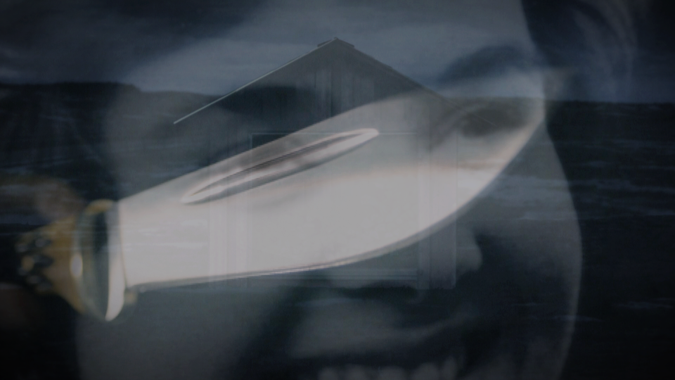
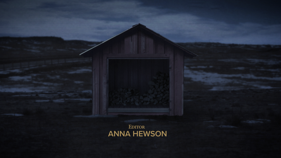
I used matte painting techniques to reconstruct various aspects of the story for the title sequence while remaining accurate to the important details. We knew the make, model, and color of station wagon the perpetrator used on that night in 1980, but the car was 40 years long gone. I did have access to actual photos of the spot where Helene’s body was found though, so I created photo-realistic matte paintings from these assets that were then projection mapped in After Effects allowing for subtle camera movement in 3D space and a bit of parallax.
For several aspects of the title sequence storyline, Anna and I shot elements that filled in the gaps where we didn’t have crime scene or evidence photos to work from. Again, following the facts and details of the story as accurately as possible, we designed and lit these shots carefully so I could color grade them to match the overall look and feel of the elements that were created entirely in the computer.
There is certainly a process to this kind of work, but it’s also equally fluid since each project is essentially a custom piece with a different set of rules and steps to get to where you need to go. You have to be well-versed in a variety of disciplines, plan as much as possible, but also be willing to give it all up and recognize a happy accident when it happens. We moved quickly on this one. The entire project from concept through design and production was a fun collaboration.
• 9Wants to Know story
